How to Choose the Perfect Fonts for Your Website: Tips, Examples, and Industry Pairings
by wsoddesigns
How to Choose the Right Fonts for Your Website
Typography plays a pivotal role in web design. Fonts not only convey your brand’s personality but also impact readability and user experience. Whether you’re designing a website for a corporate business, a creative agency, or an e-commerce store, selecting the right fonts is crucial. This guide will walk you through the key principles of choosing fonts, how they influence branding and usability, and offer font pairing suggestions for different industries.
Why Typography Matters in Web Design
Typography is more than just aesthetics—it’s a vital part of your website’s functionality and identity. Here’s why:
- First Impressions: Fonts set the tone for your website. A luxury brand’s serif typeface creates sophistication, while a tech startup might lean on clean sans-serifs for modernity.
- Readability: Clear typography ensures that visitors can easily consume your content, keeping them engaged longer.
- Brand Consistency: Fonts help reinforce your brand. Using the same typography across your website, logo, and marketing materials builds recognition.
- SEO Impact: Readable, accessible fonts contribute to positive user behavior metrics like lower bounce rates, indirectly boosting SEO.
Principles of Choosing the Right Fonts
1. Align Fonts with Your Brand Identity
Your typography should reflect your brand’s voice and message. Ask yourself:
- Is your brand formal or casual?
- Are you targeting a youthful or professional audience?
- Do you want a traditional or cutting-edge feel?
For example:
- Corporate brands: may use classic serif fonts like Times New Roman for authority and trustworthiness.
- Creative brands: might use quirky script fonts to appear playful and unique.
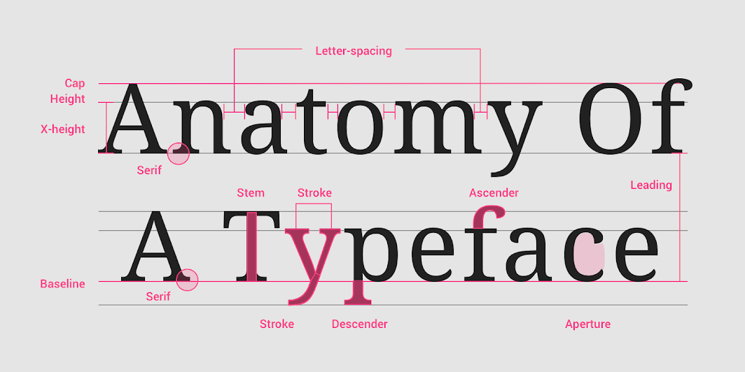
2. Prioritize Legibility
A font might look amazing but can frustrate users if it’s hard to read. For body text, stick to clean, simple fonts. Use decorative fonts sparingly for headings or accents.
Tips for Legibility:
- Avoid overly thin or condensed fonts.
- Choose a minimum font size of 16px for body text.
- Ensure adequate line spacing and contrast between text and background.
3. Pair Fonts Strategically
Font pairing involves combining two or more fonts that complement each other. The general rule is to pair contrasting fonts—such as a serif for headings and a sans-serif for body text.
For instance:
- Classic pairing: Playfair Display (serif) for headings and Lato (sans-serif) for body text.
- Modern pairing: Montserrat (sans-serif) for headings and Open Sans (sans-serif) for body text.
4. Test for Compatibility Across Devices
Your fonts should render well on all screen sizes and resolutions. Opt for web-safe fonts or include fallback fonts in your CSS.
Font Pairing Examples for Different Industries
1. Corporate and Professional Services
- Font Pairing:
- Heading: Merriweather (serif)
- Body: Roboto (sans-serif)
- Why It Works: Merriweather exudes professionalism, while Roboto ensures readability for longer content.
- Example Industries: Law firms, financial services, consultants.
2. E-Commerce and Retail
- Font Pairing:
- Heading: Poppins (sans-serif)
- Body: Source Sans Pro (sans-serif)
- Why It Works: Poppins’ rounded edges create a friendly vibe, while Source Sans Pro is easy to read for product descriptions.
- Example Industries: Clothing stores, electronics, beauty products.
3. Creative Agencies and Portfolios
- Font Pairing:
- Heading: Abril Fatface (display font)
- Body: Raleway (sans-serif)
- Why It Works: Abril Fatface adds flair and personality, while Raleway keeps the design balanced and readable.
- Example Industries: Art galleries, design studios, photographers.
4. Blogs and Content-Heavy Websites
- Font Pairing:
- Heading: Georgia (serif)
- Body: PT Sans (sans-serif)
- Why It Works: Georgia offers a classic, trustworthy look, while PT Sans ensures comfortable reading for long articles.
- Example Industries: Lifestyle blogs, news websites, educational content.
5. Tech Startups and SaaS Companies
- Font Pairing:
- Heading: Montserrat (sans-serif)
- Body: Open Sans (sans-serif)
- Why It Works: Both fonts are clean and modern, reflecting innovation and simplicity.
- Example Industries: Software companies, app developers, tech blogs.
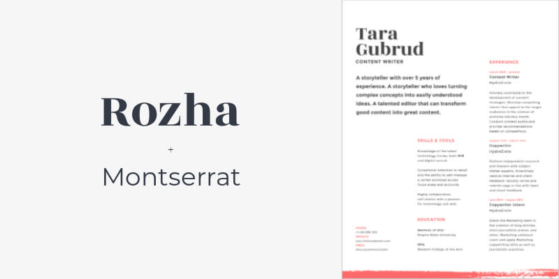
6. Hospitality and Luxury Brands
- Font Pairing:
- Heading: Playfair Display (serif)
- Body: Lora (serif)
- Why It Works: Both fonts exude elegance, making them perfect for high-end brands.
- Example Industries: Hotels, spas, fine dining.
Using Web Fonts and Tools
Google Fonts
Google Fonts is a free resource with a wide variety of web-safe fonts. You can easily embed them into your website using a simple link tag.
Font Pairing Tools
- FontPair: Helps you discover font combinations for different use cases.
- Canva Font Combinations: A visual tool to test pairings.
Custom Web Fonts
For unique branding, consider custom fonts. Services like Adobe Fonts or licensing a custom typeface can set your website apart.
Typography Tips for Better Usability
- Limit Font Choices: Stick to two or three fonts. Using too many creates visual clutter.
- Hierarchy Matters: Use different font sizes and weights to guide the reader’s eye. For example:
- Headings: Larger and bold.
- Subheadings: Medium size.
- Body text: Regular weight and smaller size.
- Consider Accessibility:
- Ensure sufficient contrast between text and background colors.
- Use fonts that support various character sets for international audiences.
Typography Trends for 2024
- Variable Fonts: These allow for more customization, like adjusting weight and width dynamically.
- Organic Fonts: Handwritten and brush-style fonts are gaining popularity in lifestyle and creative niches.
- Minimalist Fonts: Ultra-thin and geometric sans-serifs remain a favorite for tech and fashion brands.
Conclusion
Choosing the right fonts for your website is about balancing aesthetics, branding, and usability. By aligning typography with your brand identity, pairing fonts strategically, and prioritizing readability, you can create a website that’s visually appealing and user-friendly. Whether you’re designing for a corporate client or a creative startup, selecting the right fonts will help you make a lasting impression and enhance the user experience.
If you need expert help with your website design, consider our WordPress Website Package at just $297, which offers comprehensive services to create a professional and functional website. Learn more about this plan here.
Have questions or ready to get started? Reach out to us through our contact page, and we’ll be happy to assist you with your design needs!
Recommended Posts

Smarter Messaging for Modern Businesses
April 7, 2025
The Importance of Fixing Google Search Console Errors: Why It’s Crucial for Your Website’s Success
February 24, 2025
WebP, AVIF & Lazy Loading for Optimal Website Speed
January 9, 2025